Lousy Camera Interfaces

Lousy Camera interfaces
Wednesday, July 18, 2012
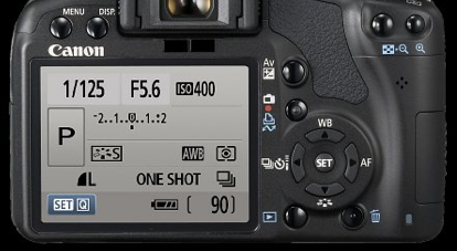
I was handed a nice new Canon earlier this summer and I had to pause. How the hell was I supposed to use this thing? I work in IT, and regularly use Windows, Mac, RedHat, iOS and all sorts of other odd systems, but this was not a simple product to just pick up and use. A good UI and UX designers is worth their weight in gold, so why then are camera interfaces so difficult? In the Canon image above, I can read shutter speed, Fstop and ISO but after that I’m lost. Plus more than half that screen is empty space. WTF? In a simple Android phone, I have a much easier interface and it’s already in my pocket.
More discussion can be found over @ ExtremeTech
"Will your next digital camera run Android?" http://www.extremetech.com/mobile/132713-will-your-next-digital-camera-run-android
If you spent $1200 on a phone you would expect an excellent interface. Truth is if you spend $100 on a phone you still can get a terrific interface. So why then can we spend such a tremendous amount on a camera and get stuck with confusing, unintuitive interfaces?


